This project won first prize in a logo competition for the Haarlem University of Applied Sciences in Haarlem, Netherlands.
The visual Identity requirements were:
positive and openminded, bold, a touch of disruption (initiator at heart), sees the world as it is & believe in humanity, succeed together
Service:
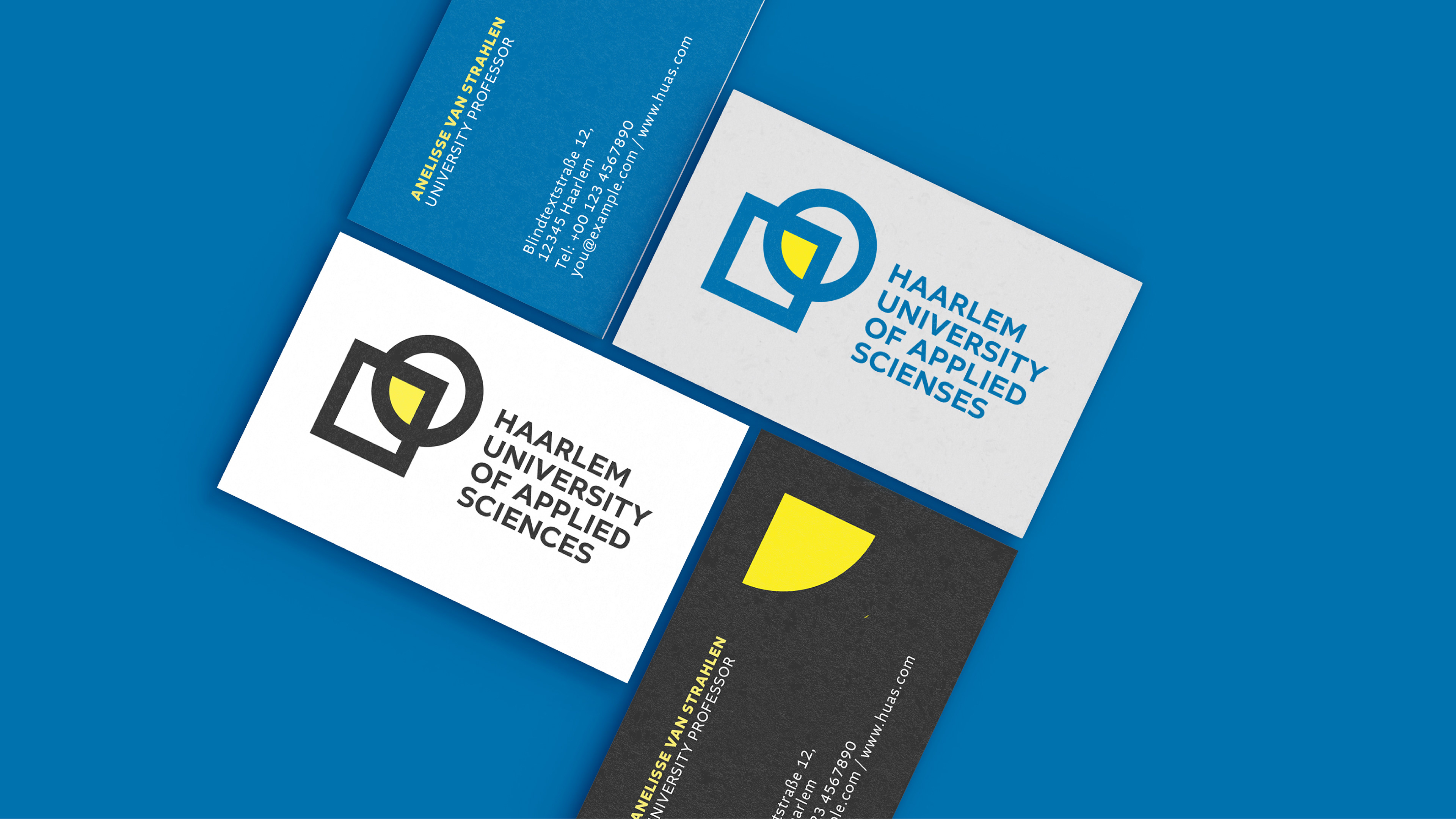
Logo Design, Corporate Design
Created with the help of: - Ps, Ai, Id
About:
Founded as a joint venture between SRH and Global School of Entrepreneurship, the private university offers bachelor's and master’s degree programs in the field of Media Communication, Business Psychology and Computer Science.
Architect: FARO Architecten/ reA architectuur / Architectenbureau J. van Stigt
Logo
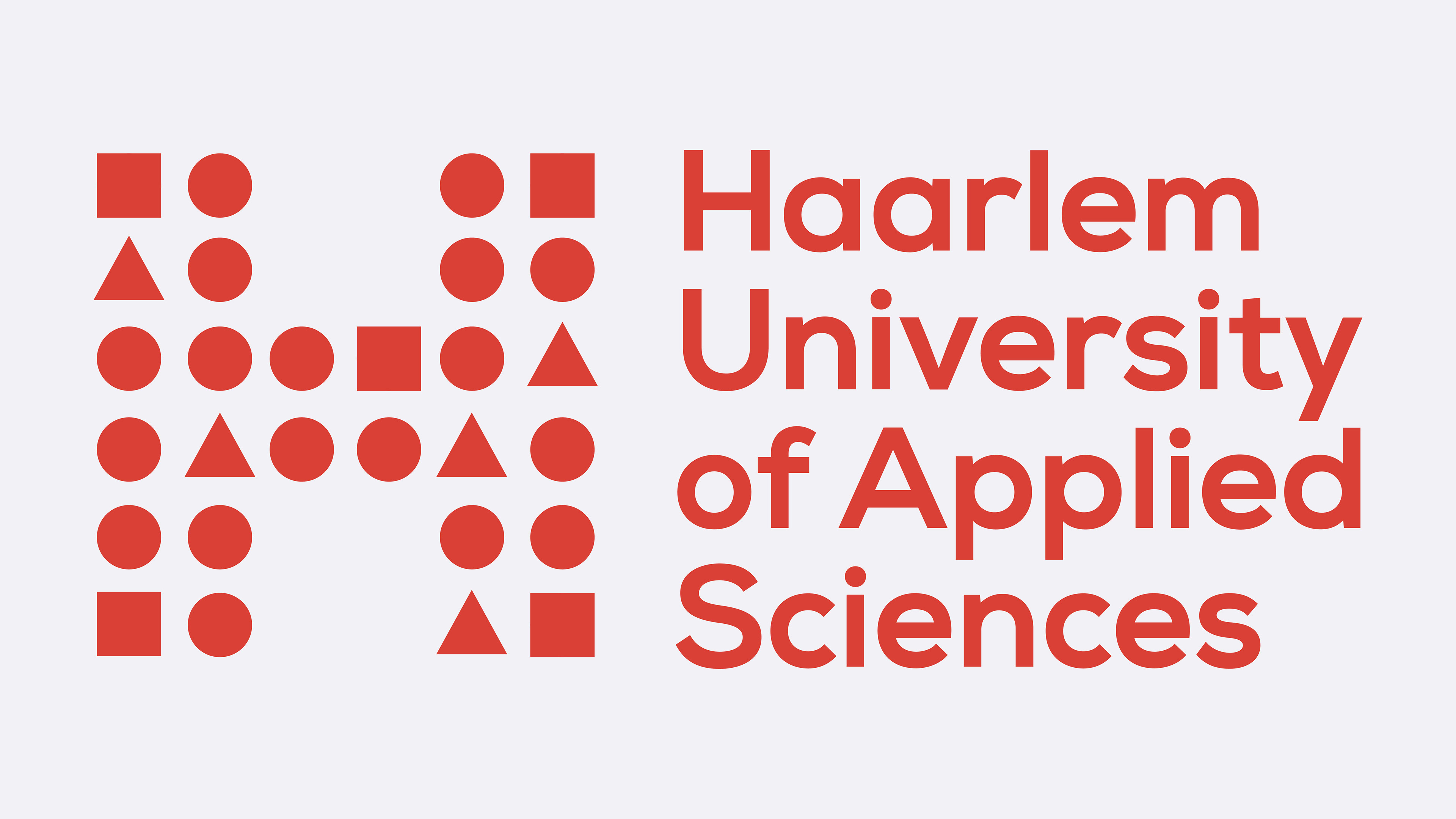
By coming together, students and teachers are shaping the university. The dots represent the people, changing their shape from round to square visualizing the people`s individual growth.
Image Editing and Imagery
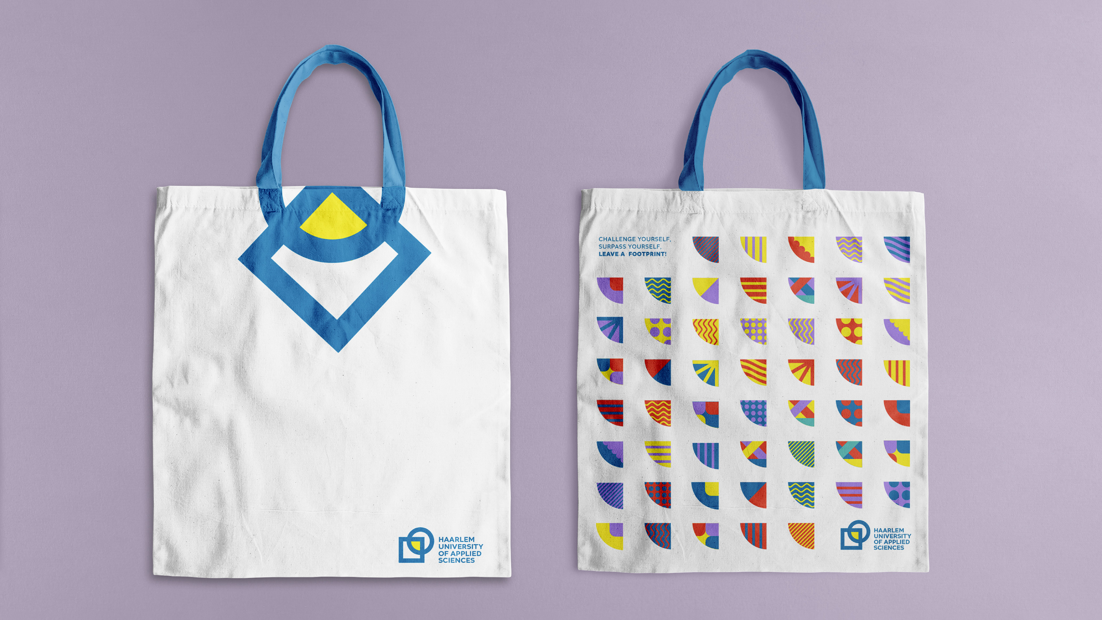
Graphic / Visual Leitmotif
Social Media
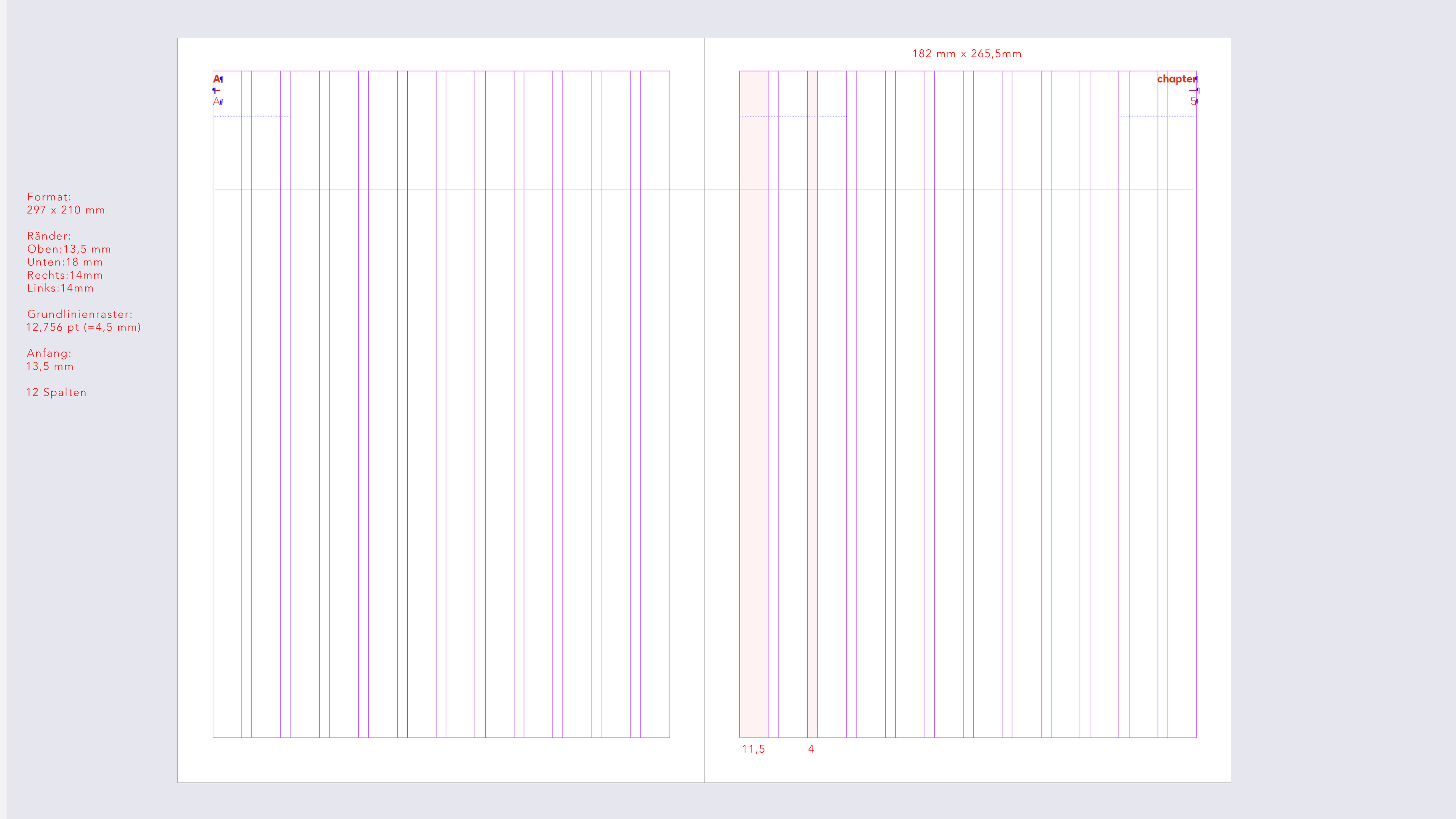
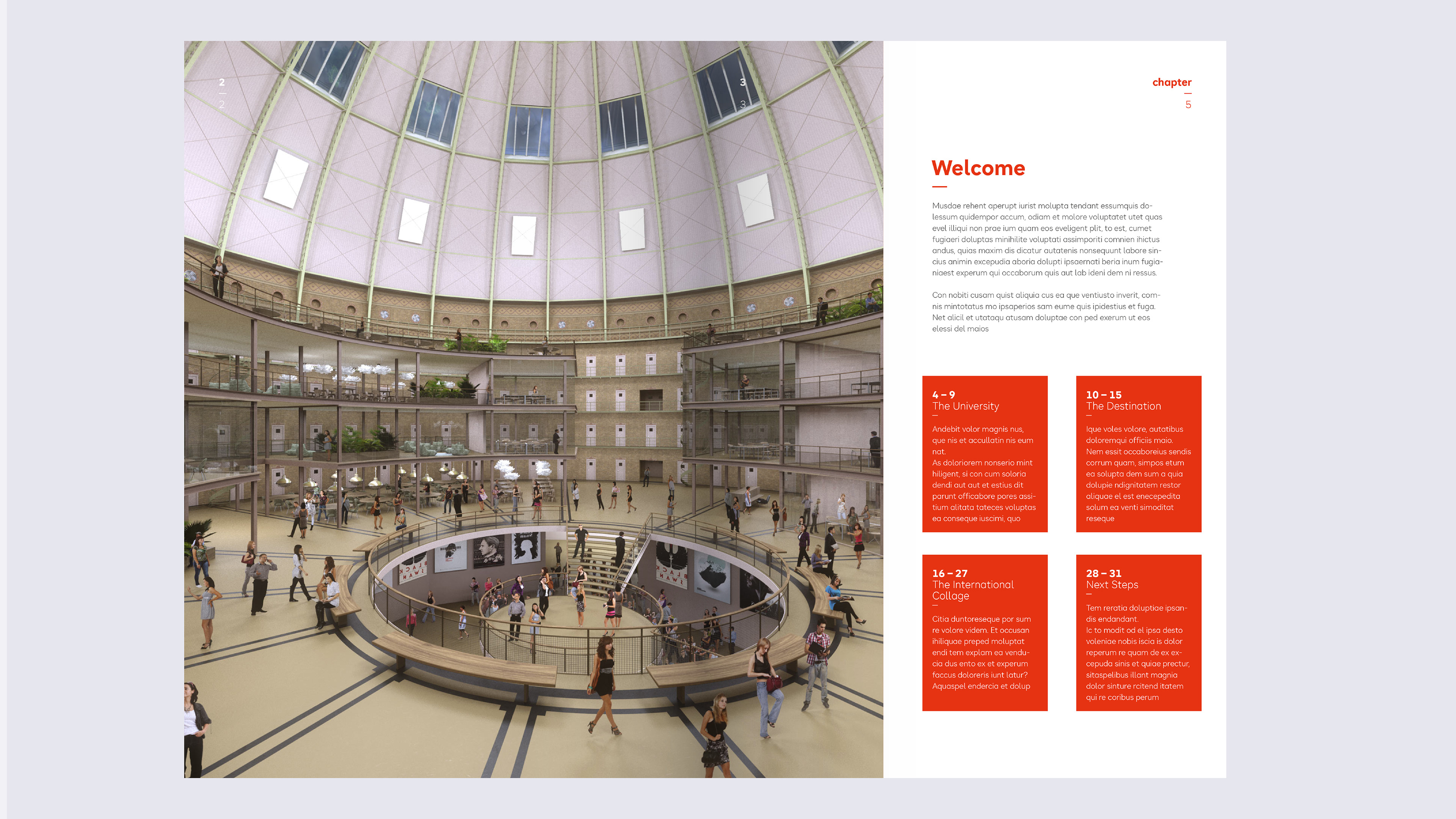
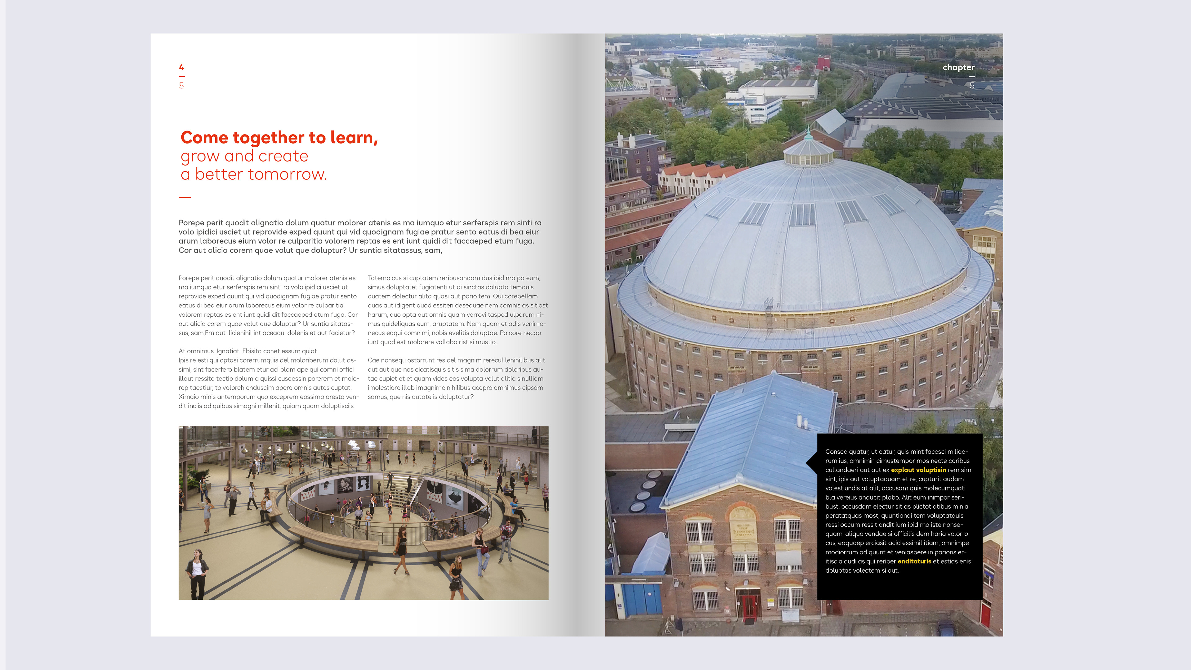
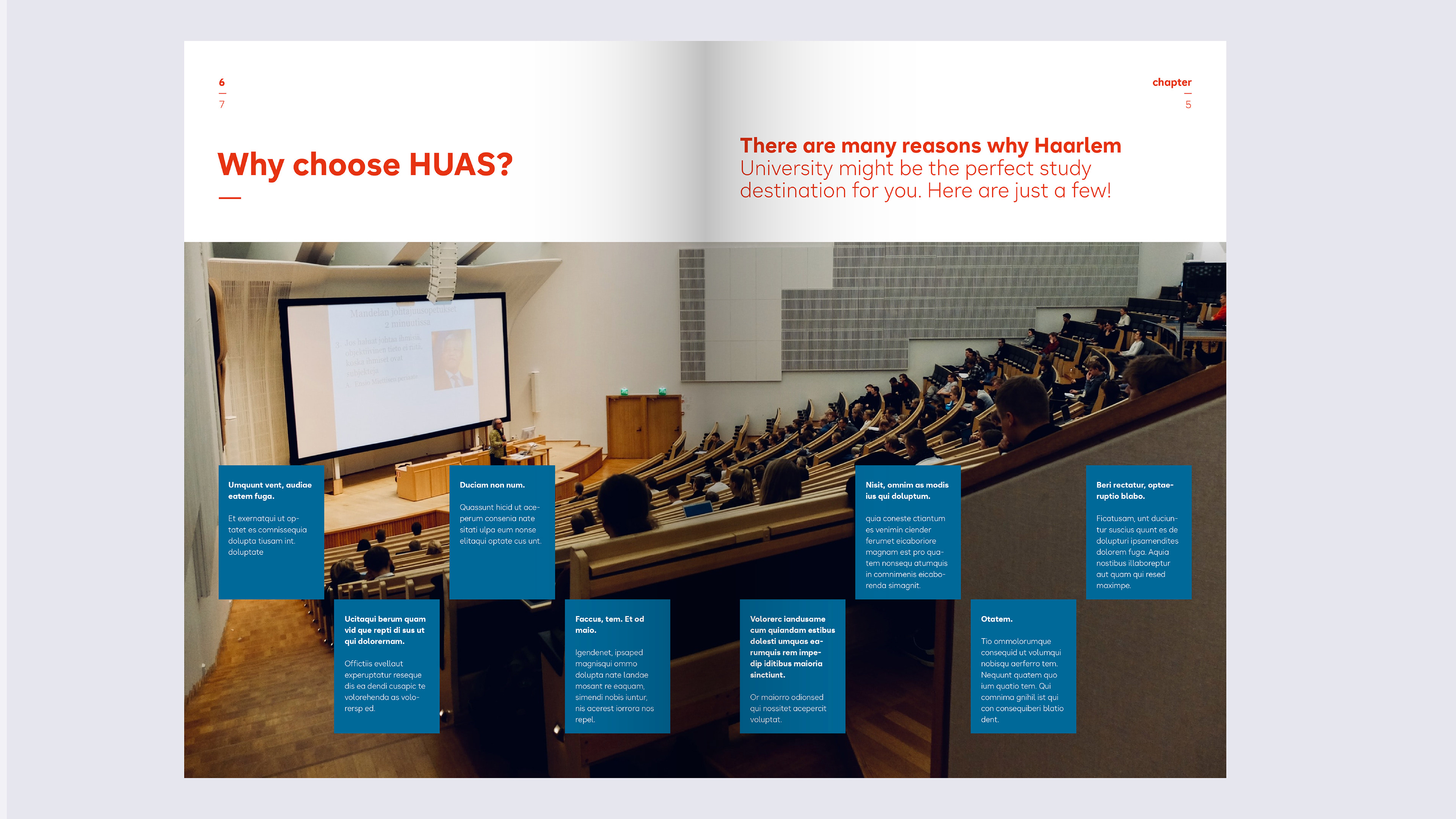
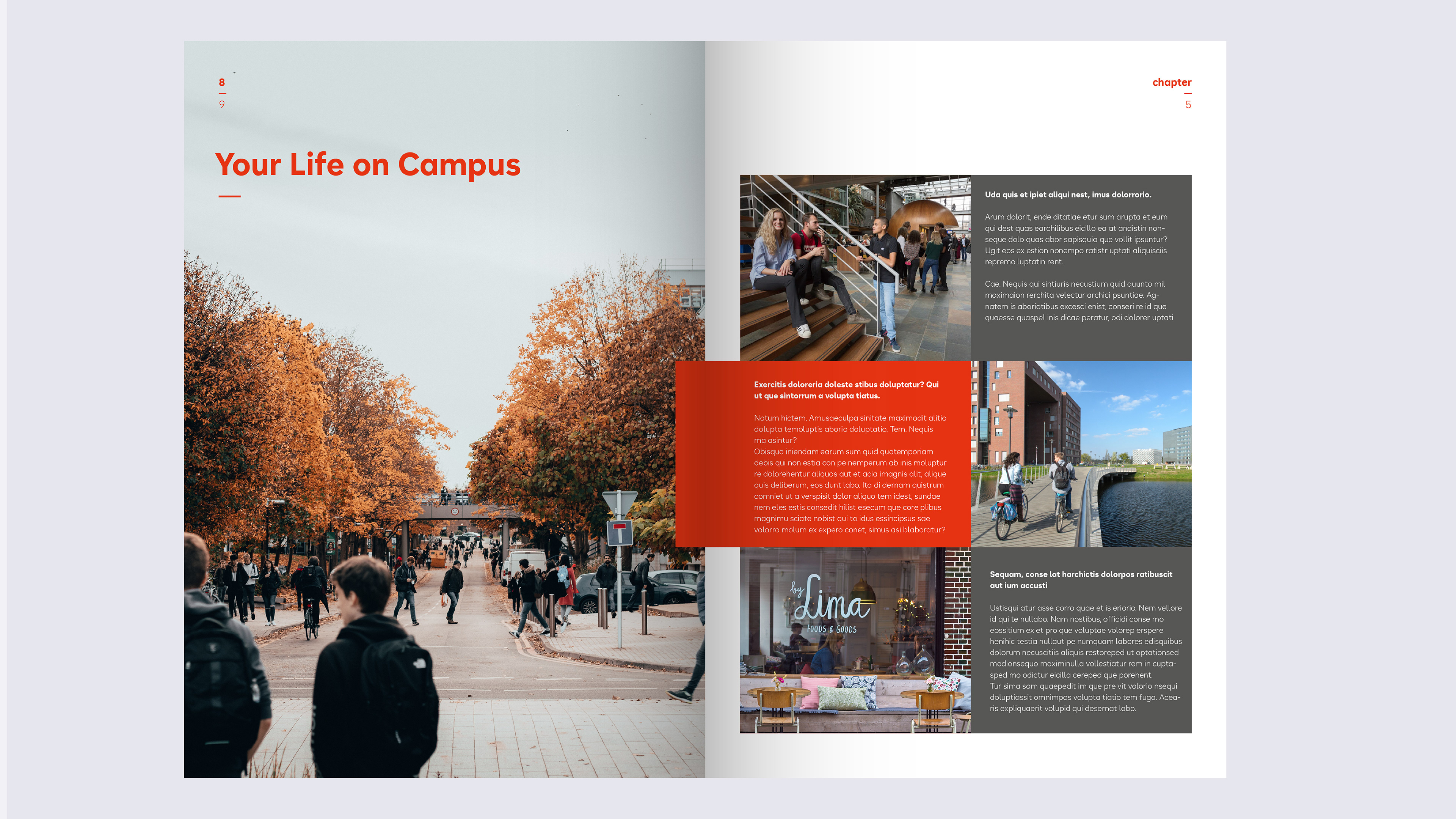
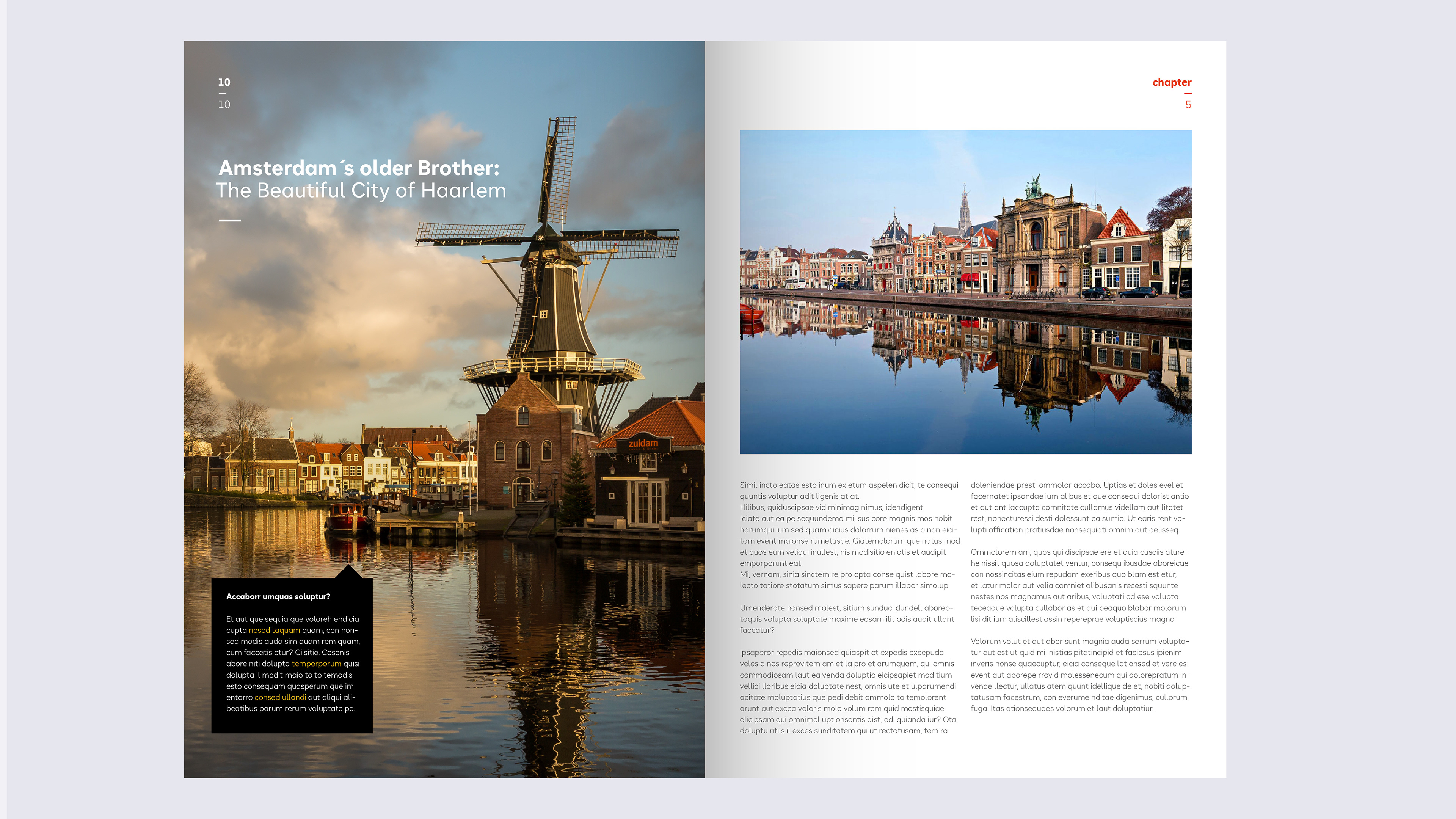
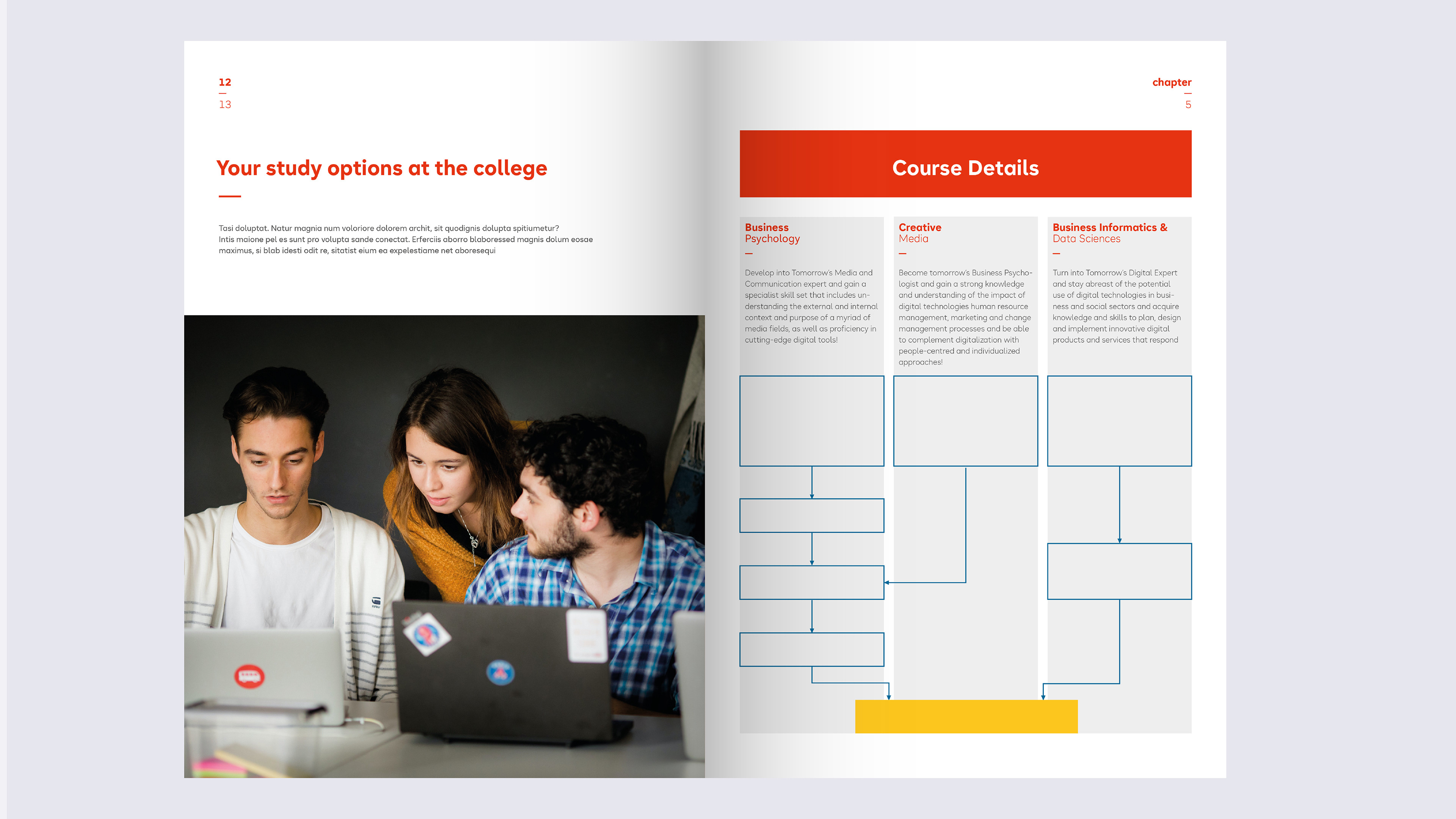
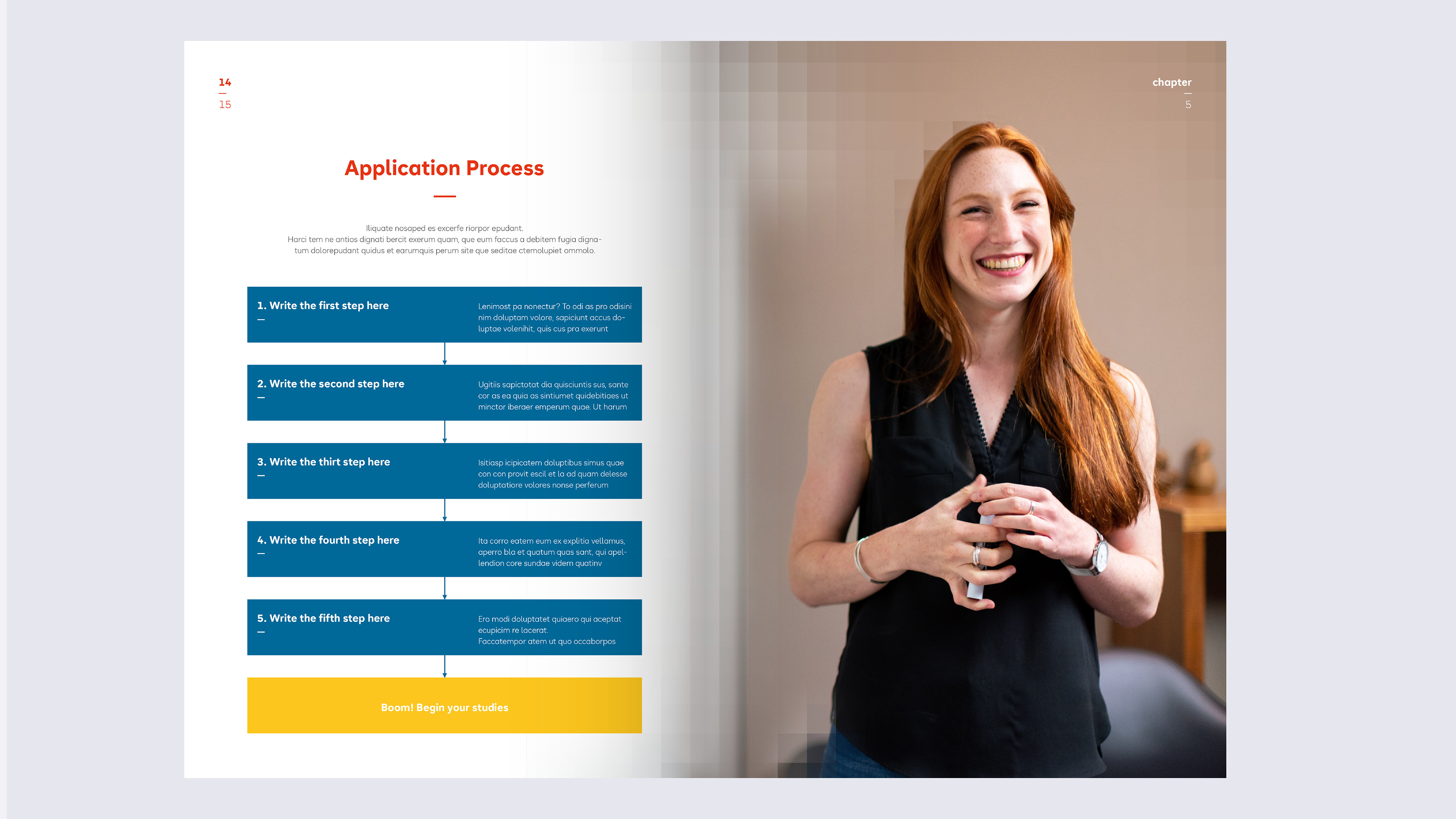
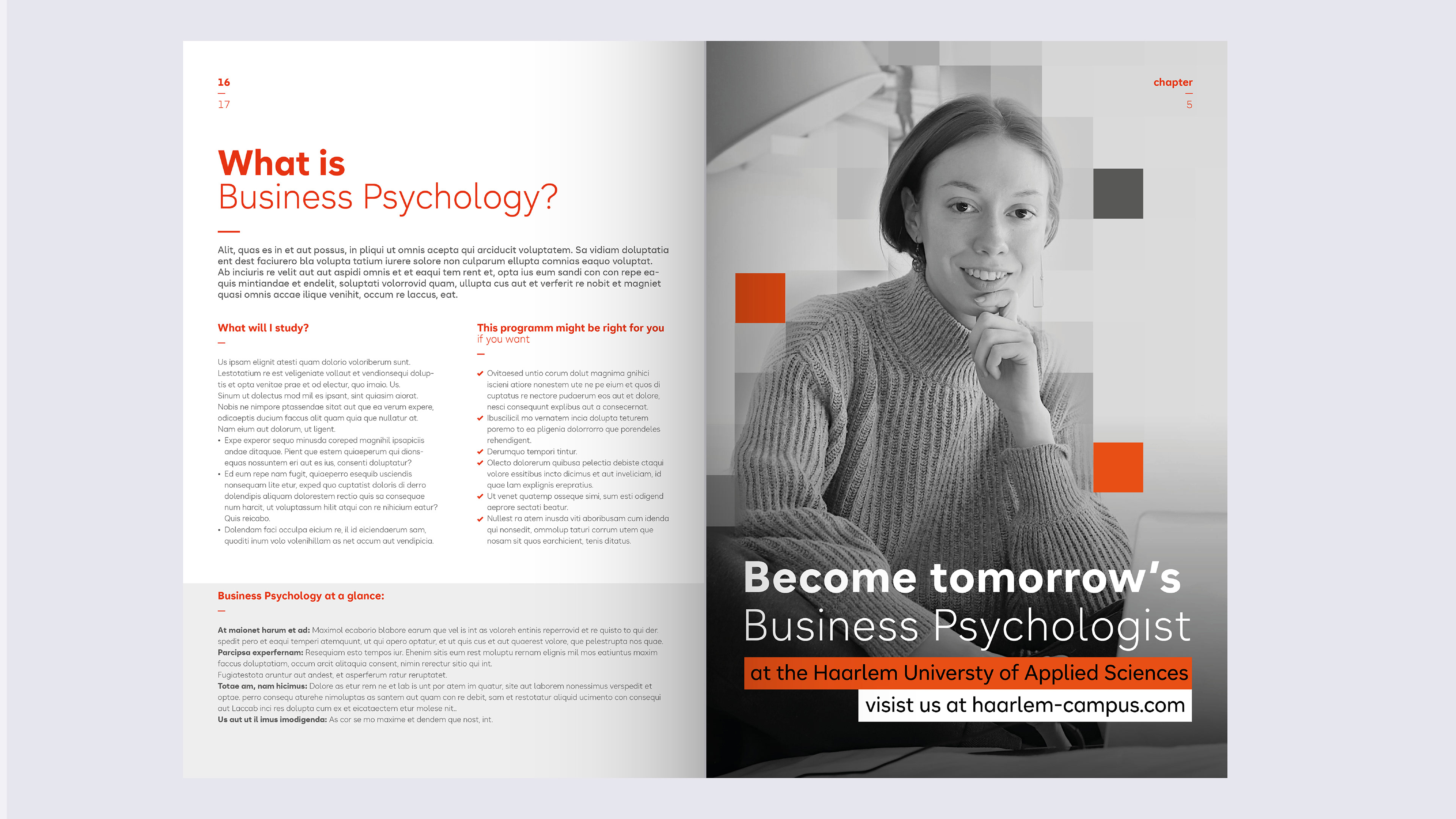
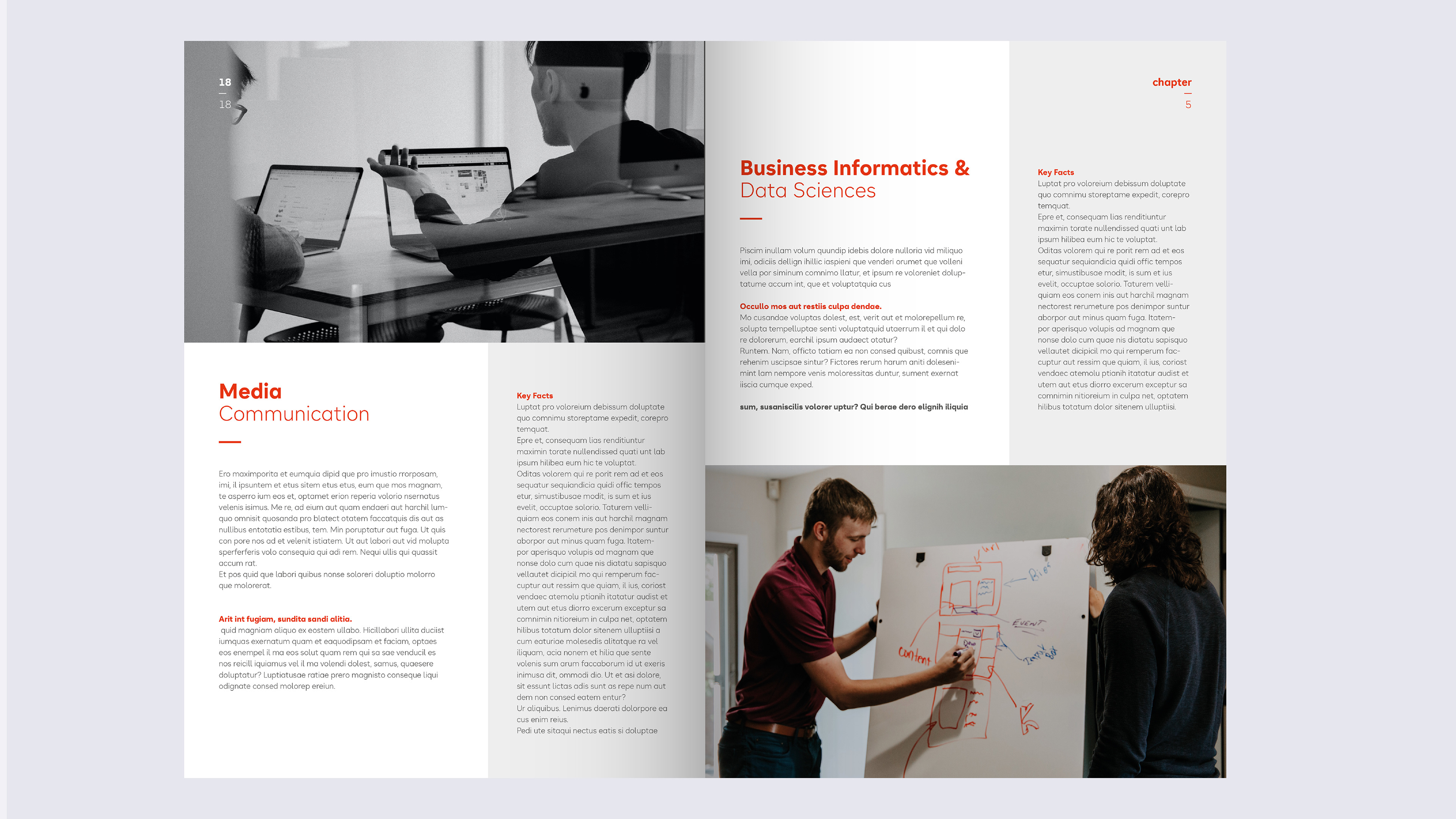
Magazin
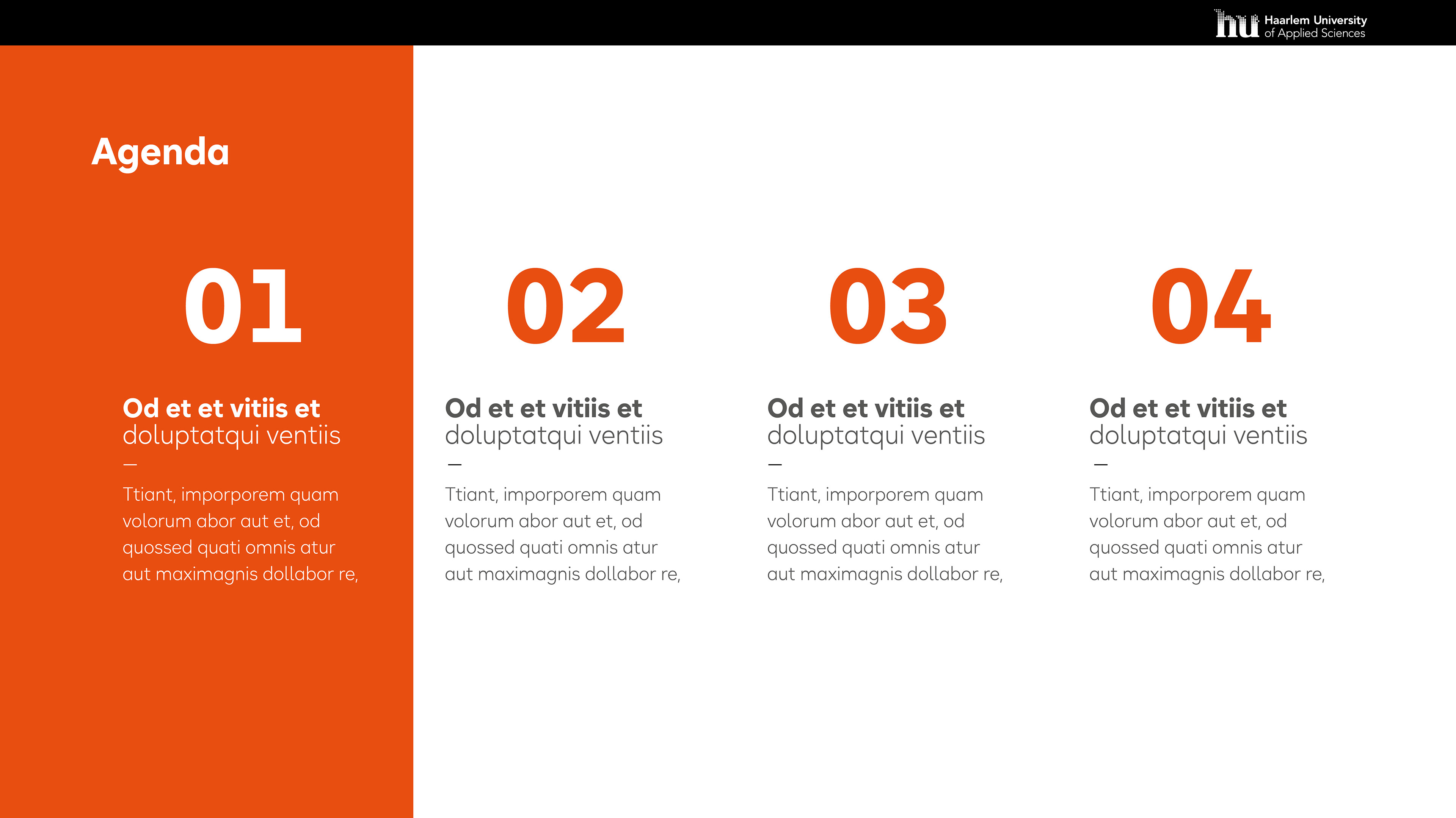
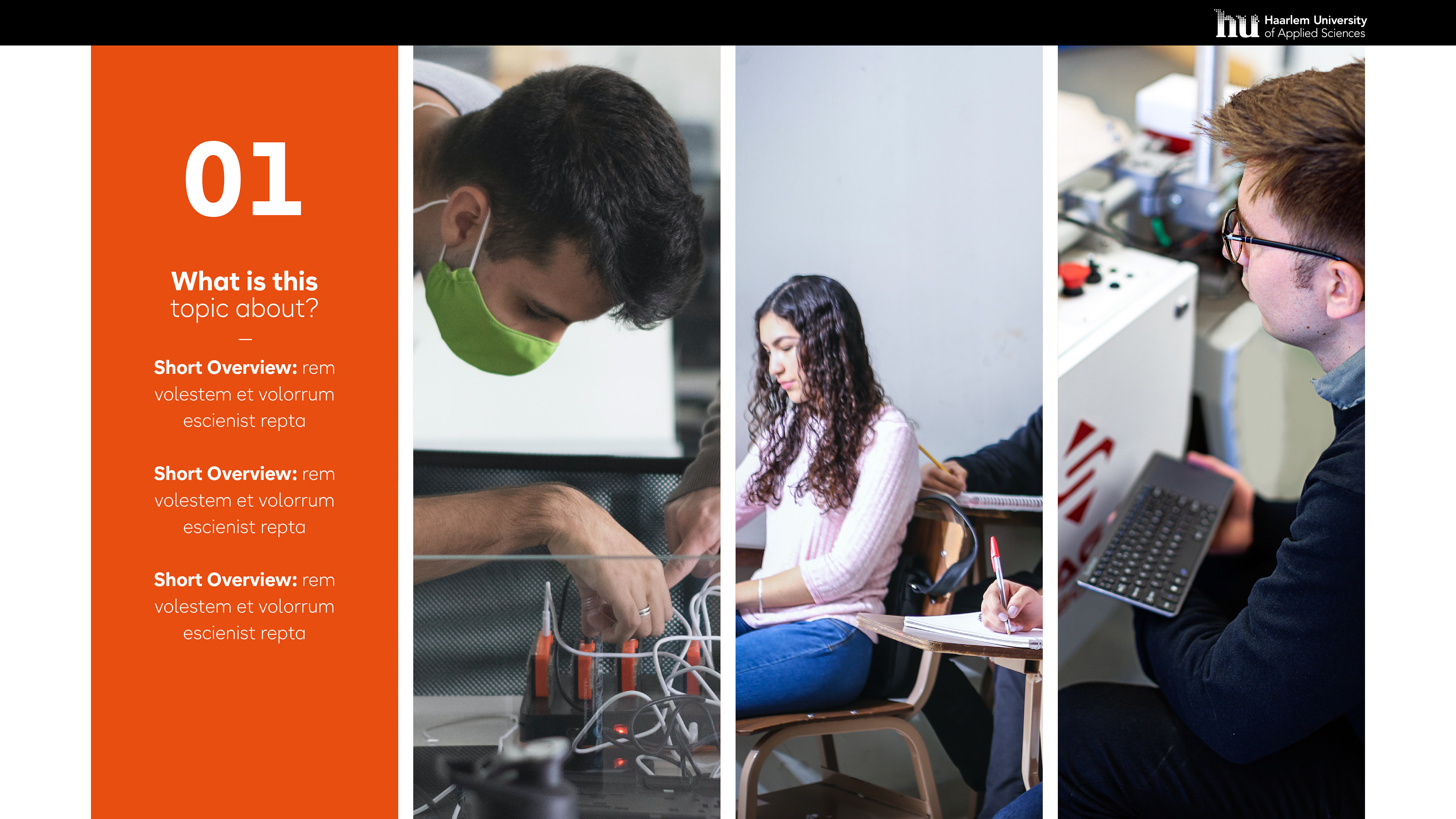
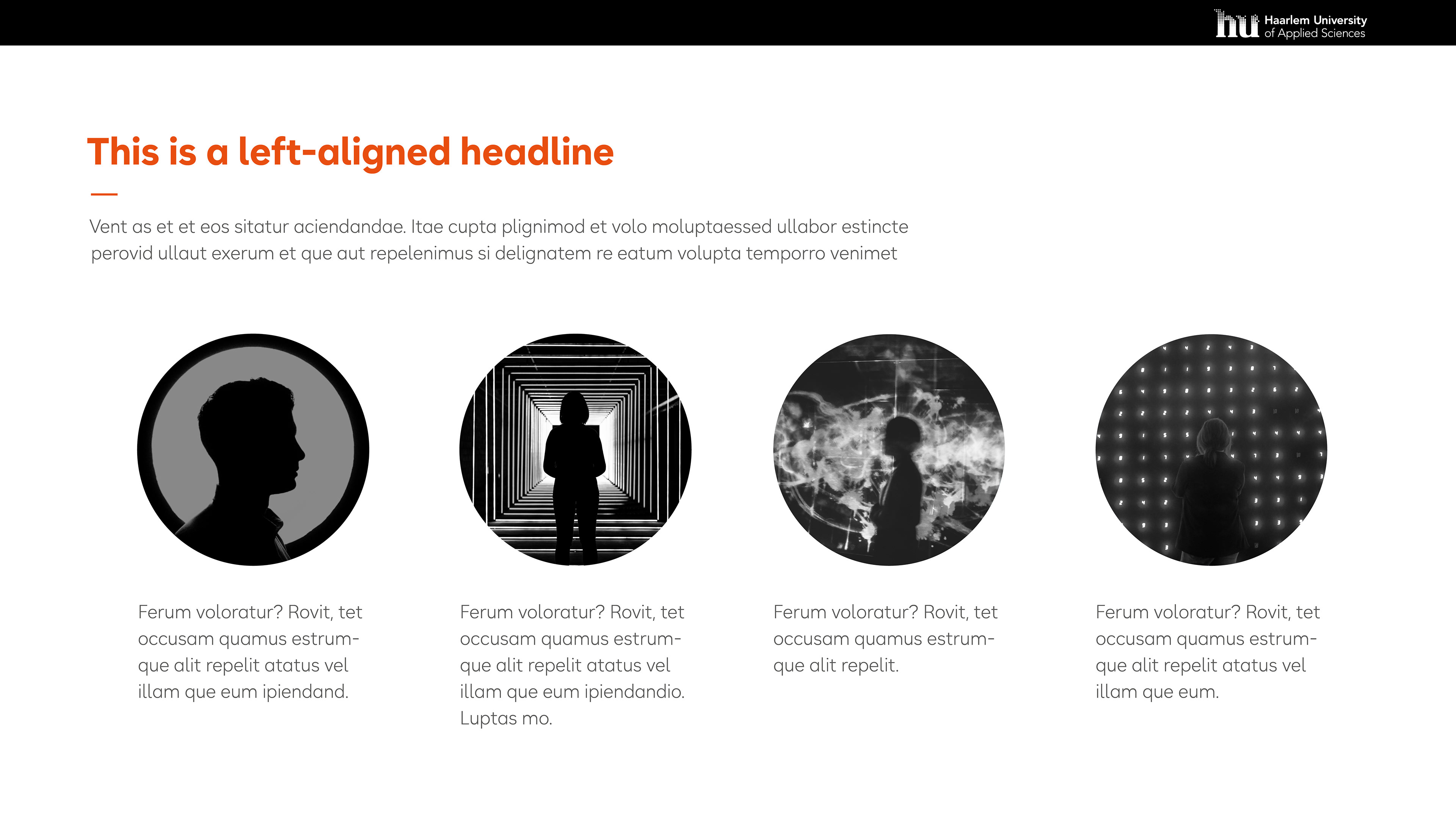
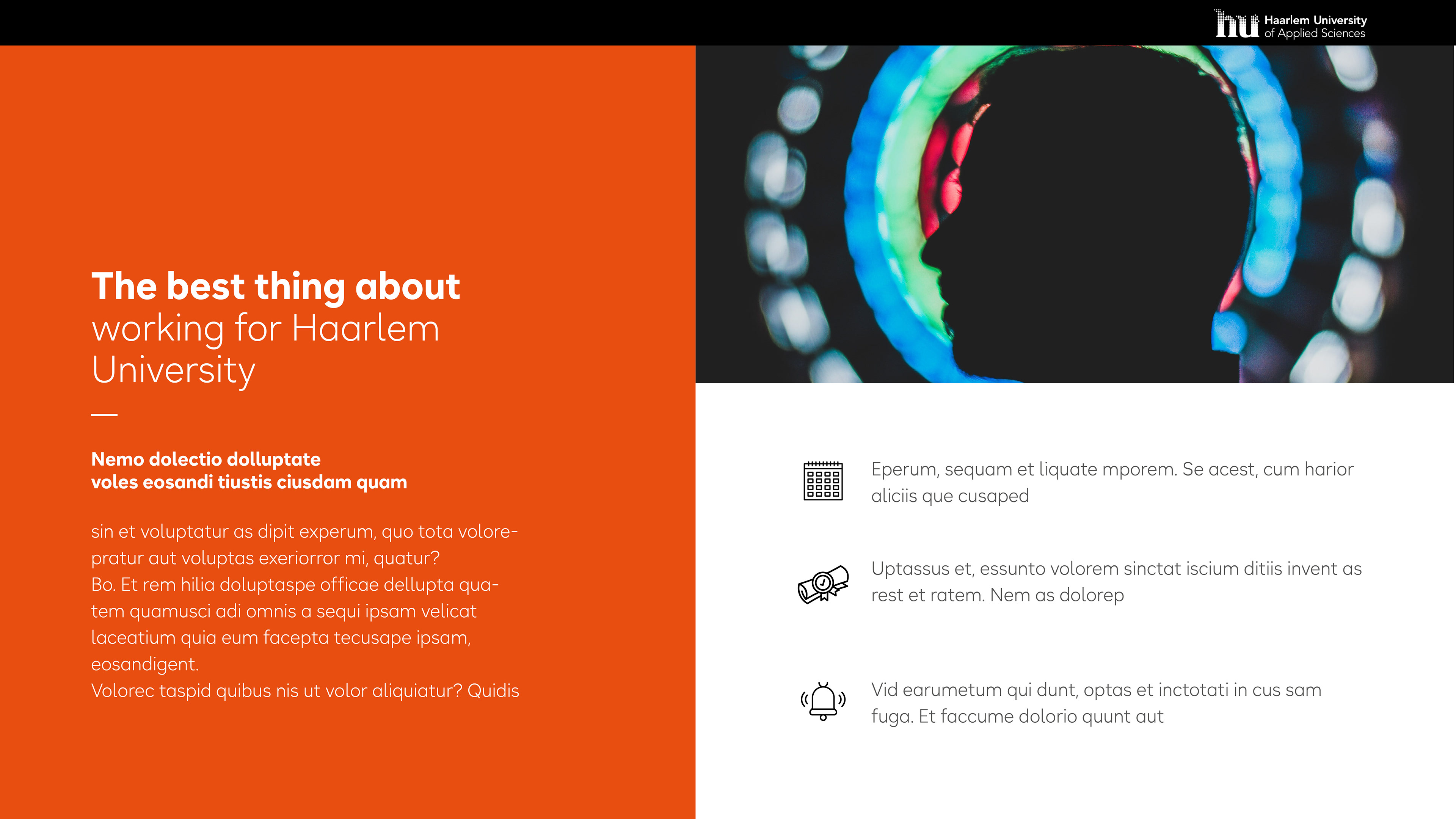
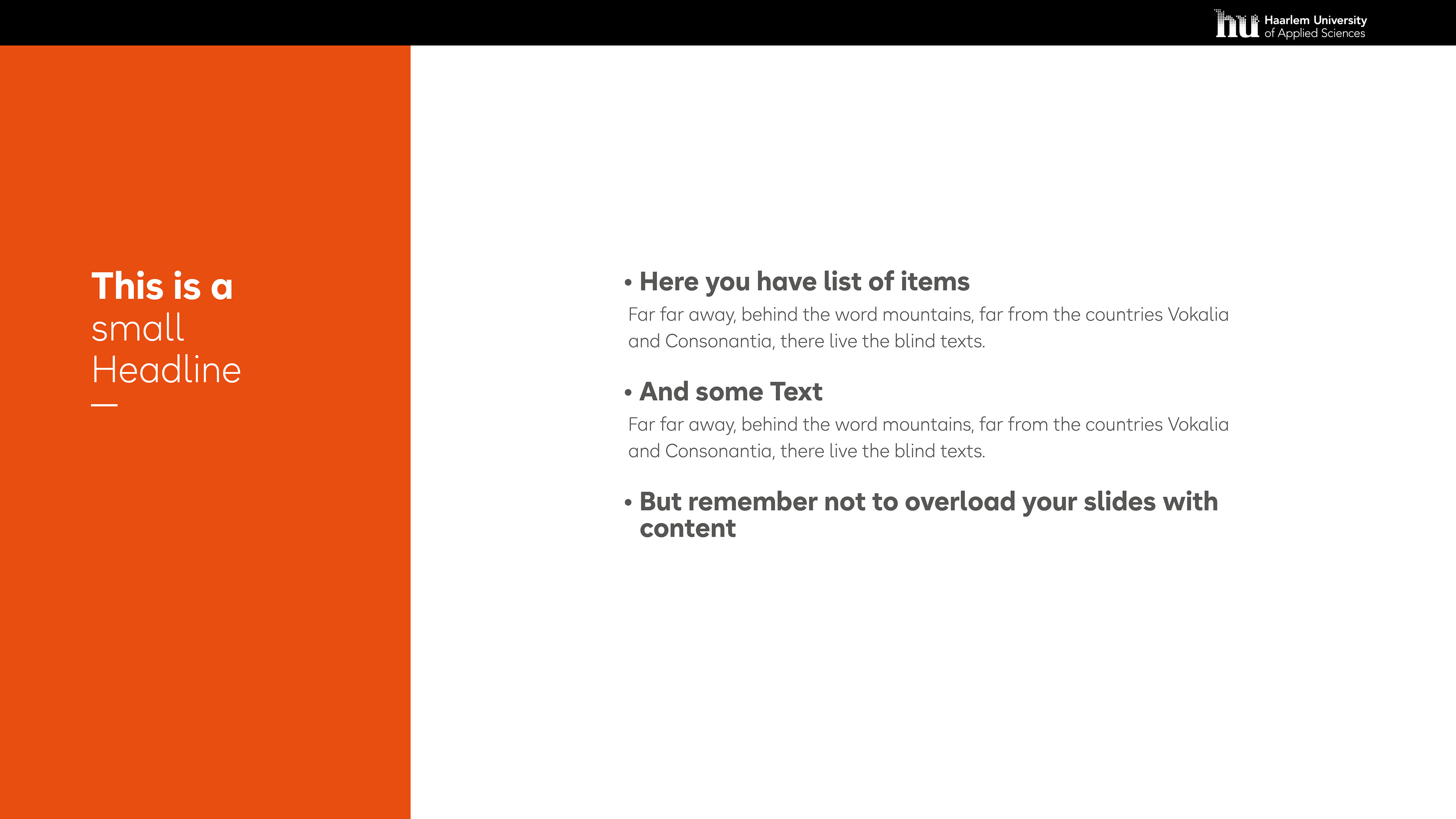
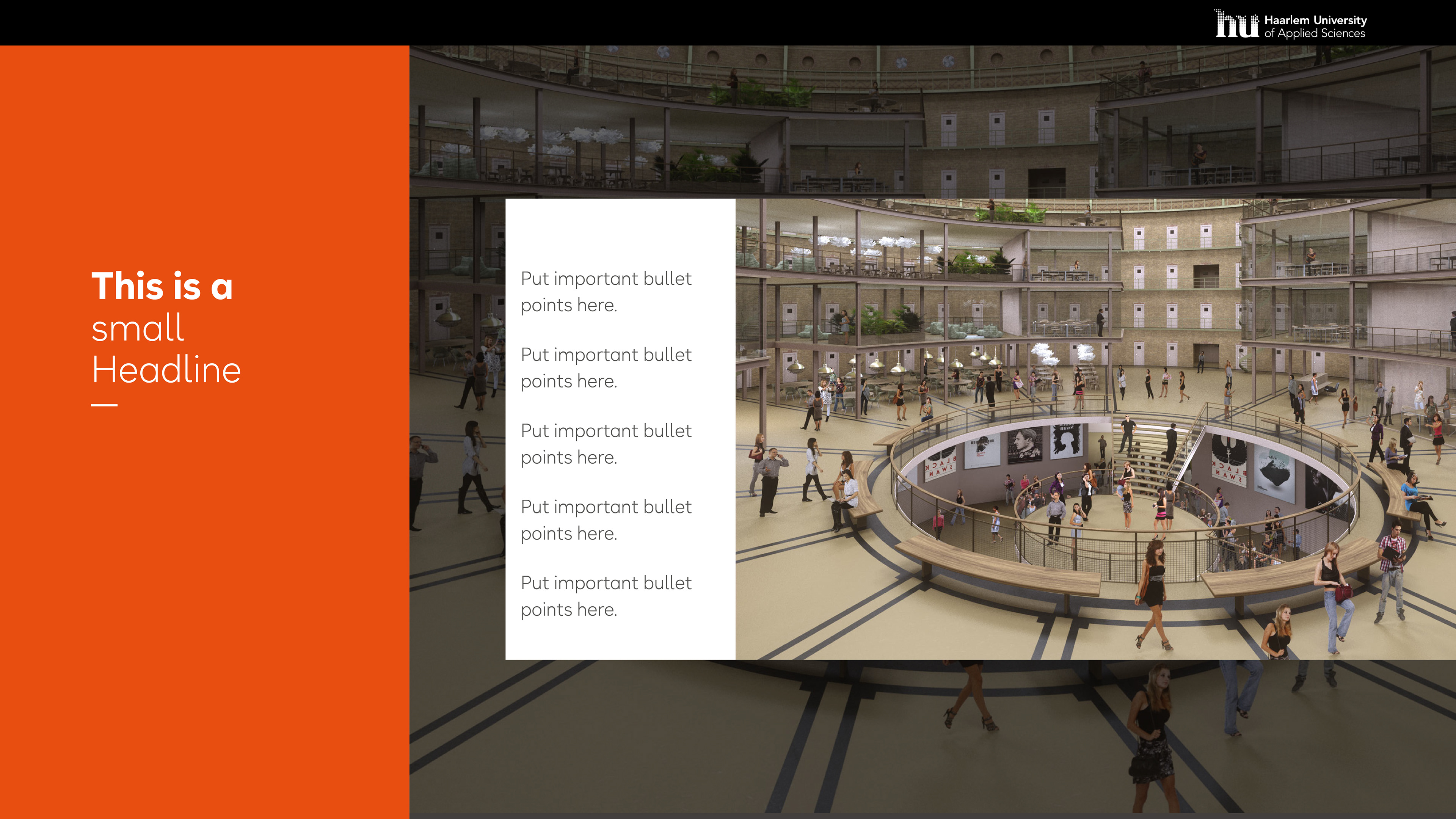
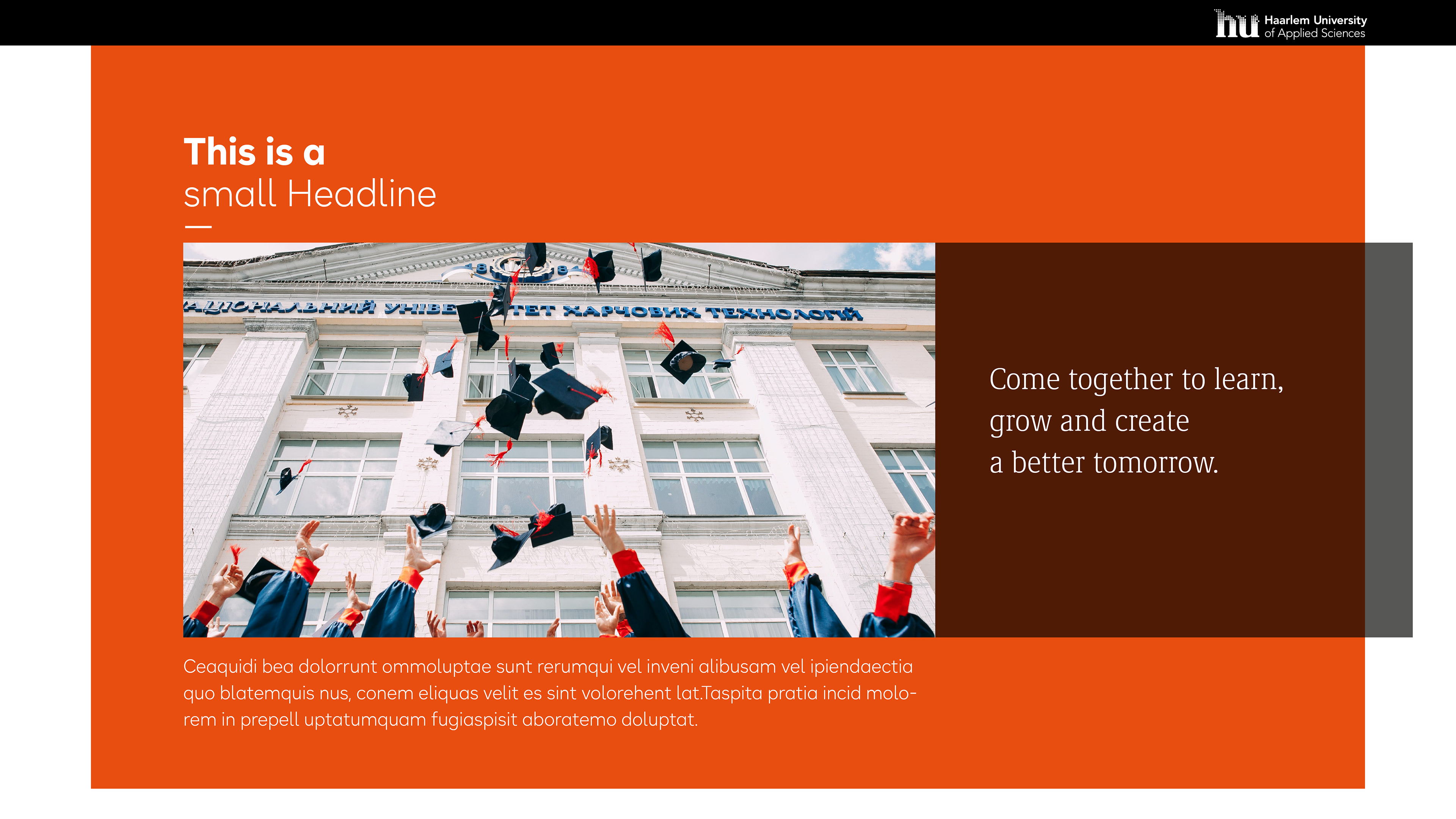
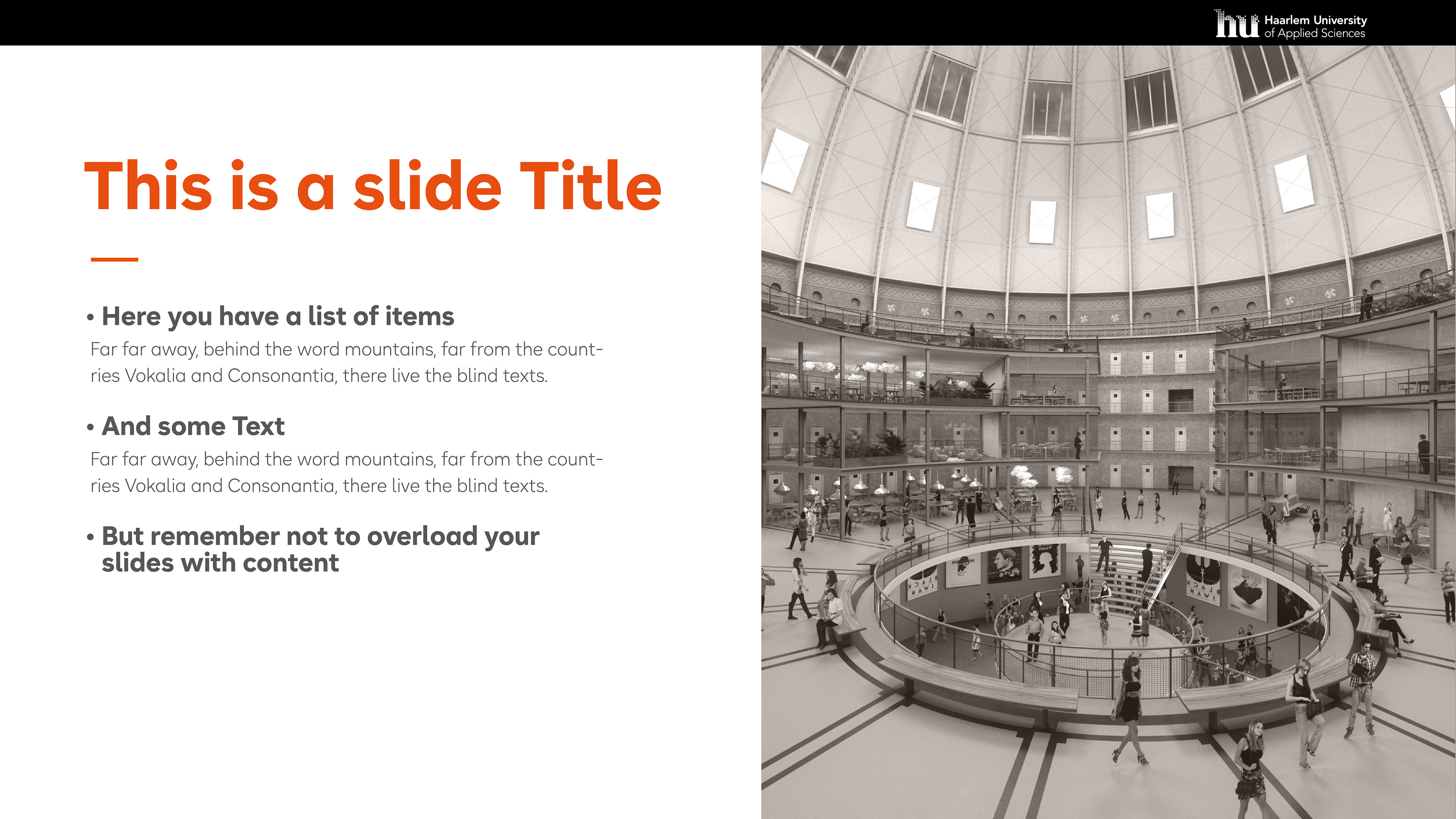
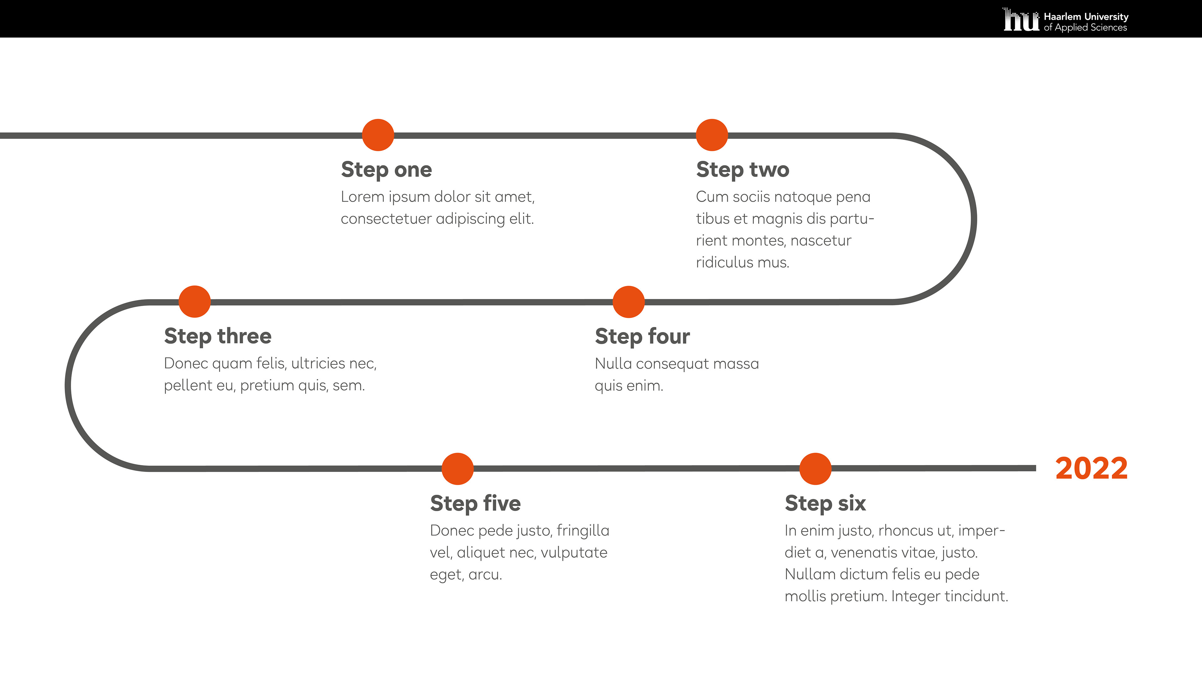
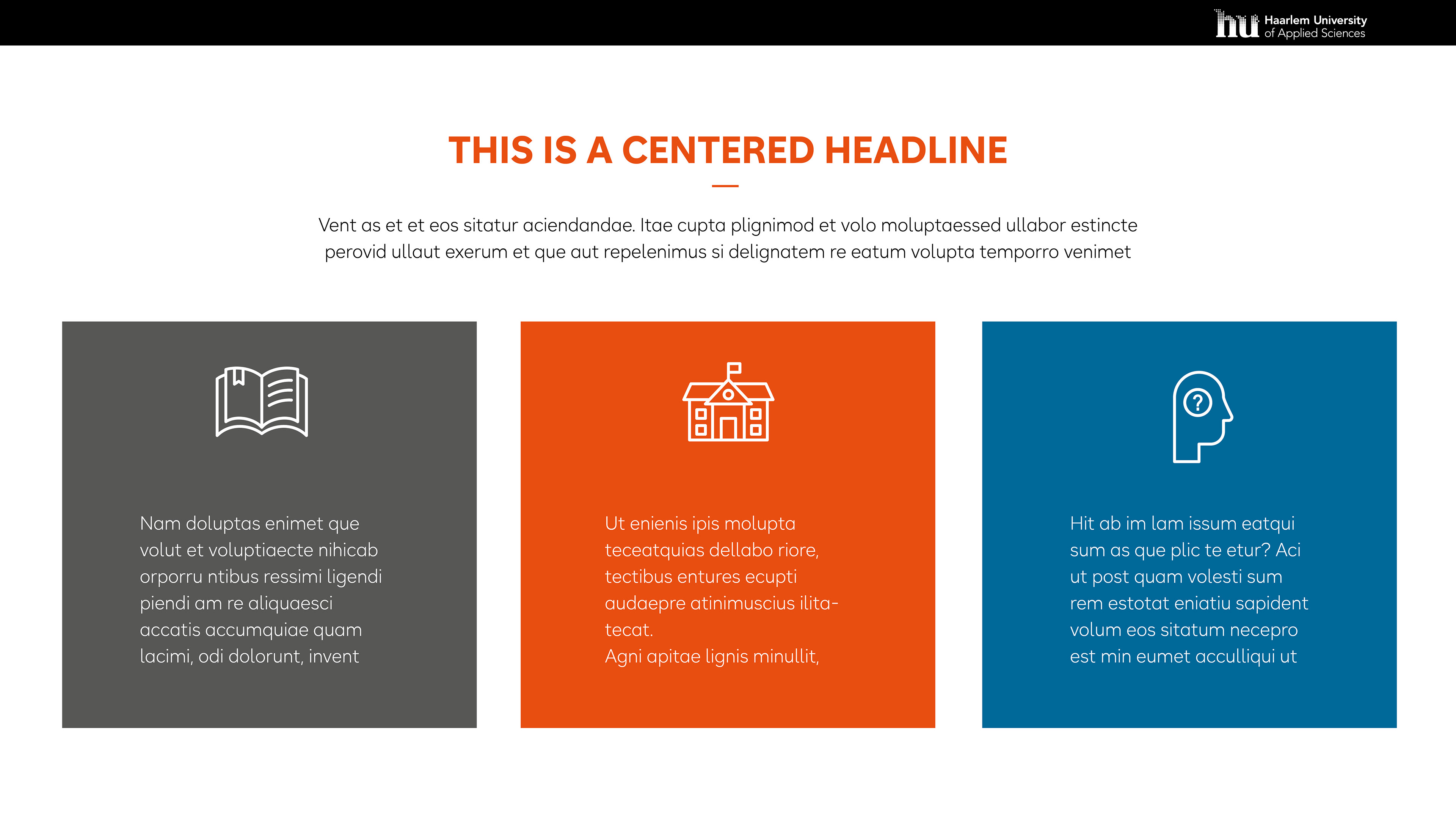
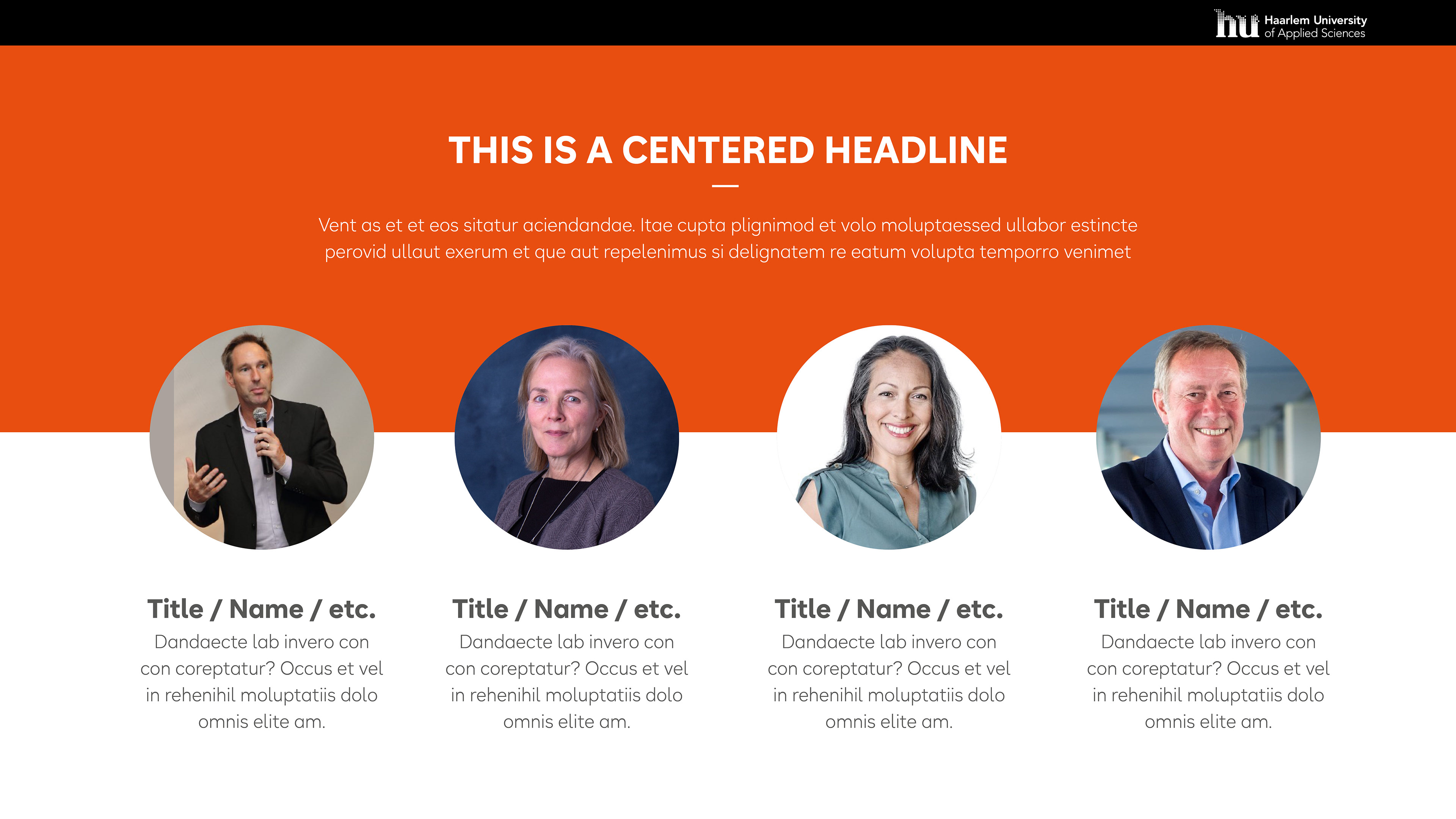
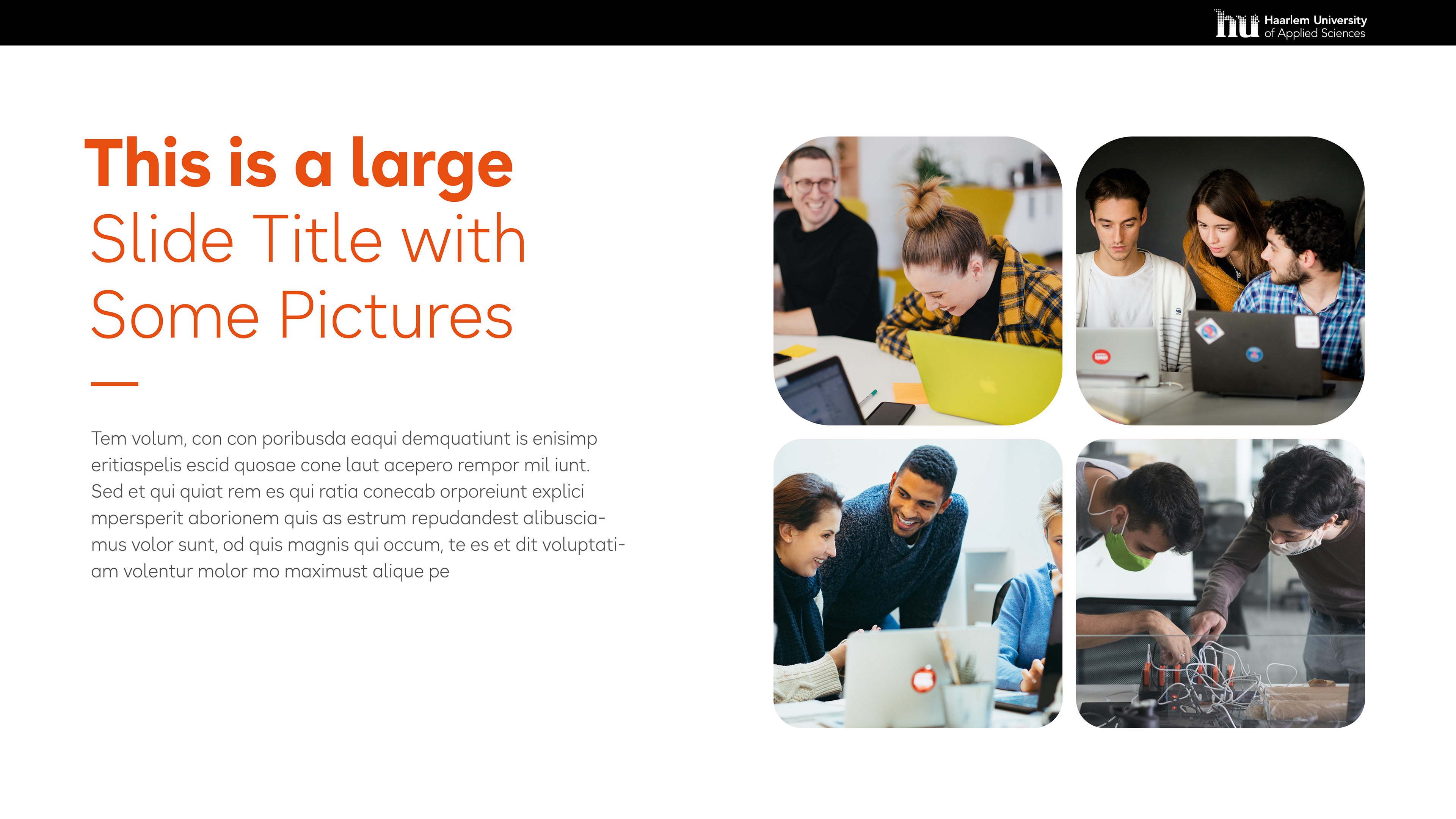
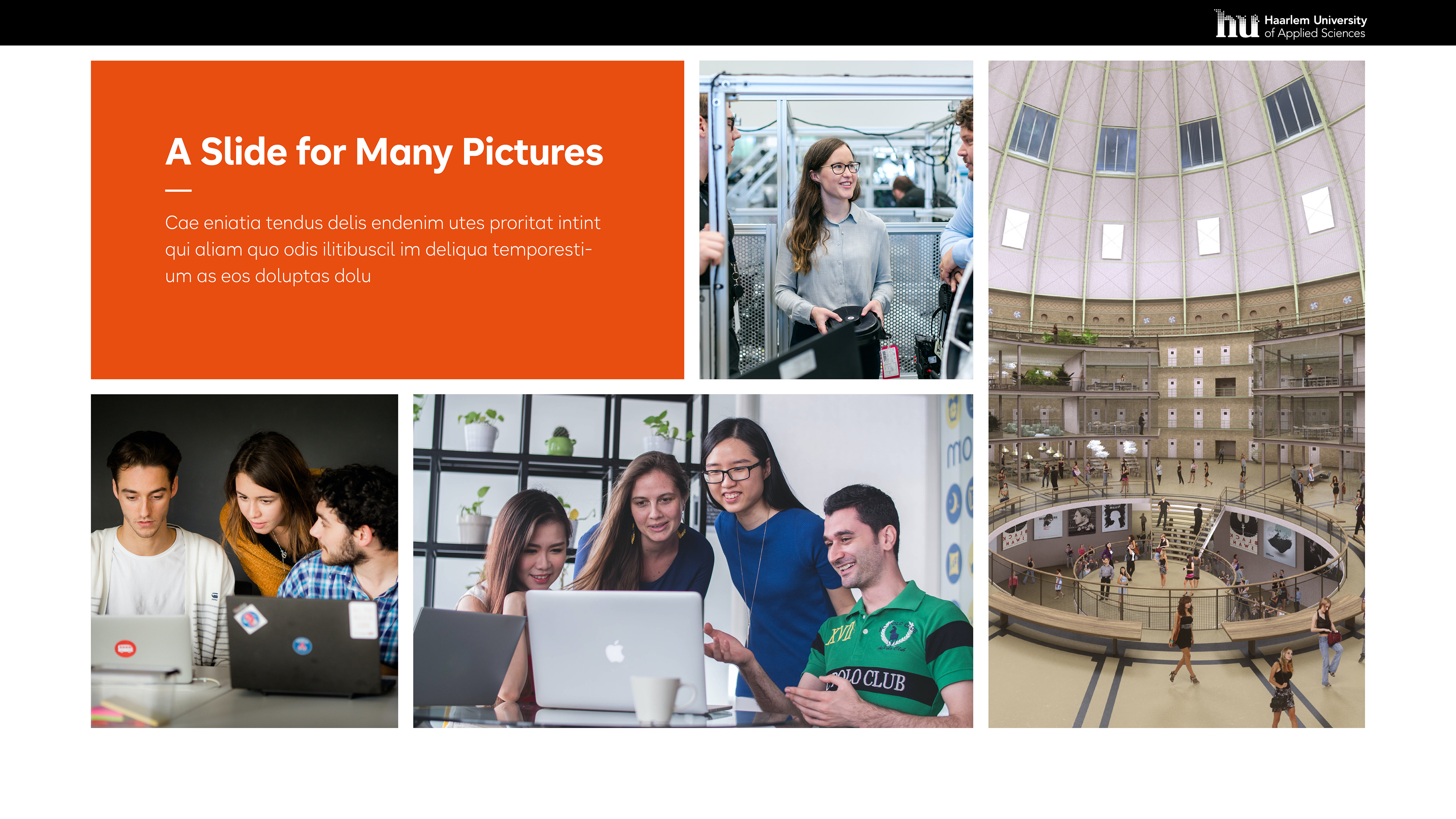
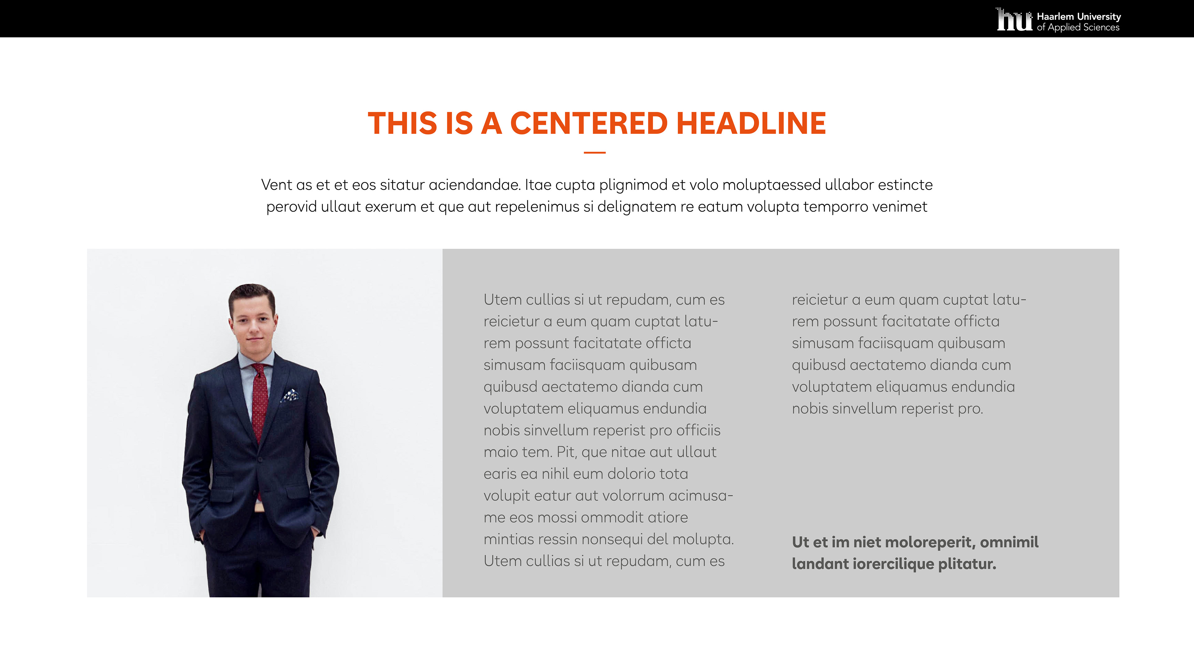
Presentation Template

Logo Drafts
Logo drafts of the first round of the competition
